Market Intelligence: a trading workspace that labels its own data
A concept build for a market monitoring and briefing workspace — a live-ticking market tape and watchlist, per-symbol charts, global indices and an economic calendar, portfolio holdings and benchmarked performance — designed so that a walkthrough never has to guess which numbers on screen are real.
About this page. Market Intelligence is a Cogwheel concept build, not a client engagement. Every price, holding, persona and portfolio on its screens is demonstration data, and there is no trading desk or fund behind it. The product labels this itself throughout, which is the point of the build rather than a disclaimer bolted onto it. What is real is the design and engineering, which is what this page is about.
The brief
A demo of a financial product has a specific problem that most demos do not. The screens are covered in numbers, and a viewer has no way to tell which of them came from a real feed and which were invented to make the screenshot look busy. Once one figure turns out to be fabricated, every other figure on the page becomes suspect.
Market Intelligence treats that as the design problem rather than an afterthought. It is a full market monitoring workspace — watchlist, charts, global indices, portfolio and analysis — built so that the provenance of every panel is stated on the panel itself, and so that an executive walkthrough can be given without anyone having to caveat the screen out loud.
Walk through it
Six sections of the workspace: the dashboard, the stocks view, global markets, the portfolio, performance against a benchmark, and the analysis screen. Select a thumbnail to change the frame, or open any image full screen.
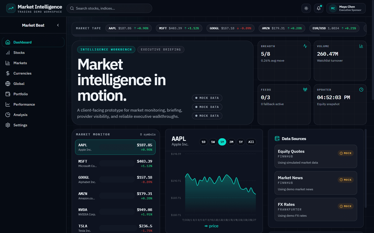
Intelligence workbench
The default view. A market tape runs across AAPL, MSFT, GOOGL, AMZN and EUR/USD above four cards — breadth, watchlist turnover, active feeds and last updated. Below, a Market Monitor watchlist of 8 symbols sits beside a per-symbol price chart, and a Data Sources panel names each provider (Finnhub for quotes and news, Frankfurter for FX) with its state marked MOCK.
Market Monitoring
Watchlist, per-symbol charts and a live-ticking market tape
Portfolio Analytics
Holdings, allocation and performance against a benchmark
Labelled Provenance
Each section states whether it runs on a feed or a demo fixture
How it is built
A monitoring workspace whose most deliberate feature is what it refuses to fake.
Every section states where its numbers came from
The Data Sources panel names each provider and marks its state. Sections running generated data carry an amber banner that names exactly which panels are fixtures and which are on a feed — on the Analysis screen, sector performance, risk scoring, portfolio distribution and technical signals are called out as fixtures while equity and crypto pricing run live or on a fallback.
The data moves
The market tape, watchlist and KPI cards tick continuously rather than sitting on a static frame — prices and the last-updated stamp differ between one capture and the next taken a minute later.
Nine sections behind one sidebar
Dashboard, Stocks, Markets, Currencies, Global, Portfolio, Performance, Analysis and Settings share a collapsible sidebar and a persistent header, so the workspace reads as one product rather than a set of separate pages.
Charts sized to the question being asked
Per-symbol price series with 1D through All range switching, portfolio value against the S&P 500, a year-to-date sector bar chart, an allocation pie, a monthly-returns grid and a performance heatmap — each chart type chosen for the comparison it has to support.
What these screens argue
Each screen makes the same case in a different register: a number is only worth showing if you also say where it came from.
The workbench opens on its own provenance
The dashboard puts the Data Sources panel in the first screenful, beside the watchlist rather than buried in a settings page. Each provider is listed with its state marked, and a Demo Scenario panel names the persona the walkthrough is running as, along with a risk posture and a watchlist focus.
N/A rather than a plausible number
On the Global screen, markets with no connected provider render N/A. Filling those cells with generated figures would have made the screen look more complete and every other number on it less trustworthy; leaving them empty is what lets the populated cells be read at face value.
The caveat is specific, not blanket
Rather than one disclaimer covering the whole product, each section names its own position: performance history is generated demo data so that portfolio analytics can be shown without account connectivity, and global indices and calendar events are curated fixtures until an index or calendar provider is connected.
Built with
Provenance as a design constraint
Most dashboards treat data source as configuration — something set once and hidden. Here it is surfaced in the interface: providers named on the dashboard, per-section banners distinguishing fixtures from feeds, and empty cells left visibly empty. The constraint costs screen space and buys the one thing a financial demo otherwise cannot have, which is a viewer who believes the numbers.
Want something built to this standard?
This is the level of design and engineering we bring to client work — whether that is a marketing site, a full-stack application, or the platform behind it.