PropertyIQ: a business intelligence platform for property managers
A concept build for a multifamily and commercial property management BI platform, bringing financial reporting, rent collection, lease-expiration risk, leasing funnel, and maintenance analytics into one console.
About the numbers on these screens. PropertyIQ is a Cogwheel concept build, not a client engagement. Every property, tenant, and financial figure shown is fictional demonstration data, and the “Modelled Impact” figures in the gallery below are illustrative projections, not measured results from a customer deployment. What is real is the design and engineering, which is what this page is about.
The brief
Property managers running a portfolio typically track financial performance, rent collection, lease renewals, leasing pipeline, and maintenance work across separate spreadsheets and point tools, each reconciled by hand. PropertyIQ demonstrates what a single BI layer over that same data could look like.
The build needed to carry six distinct operating views — each with its own charts and tables — inside one shell, without the page turning into a wall of numbers no manager would actually read.
Walk through it
Sixteen views across the platform. Select a thumbnail to change the frame, or open any image full screen.
Executive Dashboard
Comprehensive property management overview with KPI summaries, occupancy rates, revenue trends, and critical alerts
Property Management Business Intelligence Platform
Comprehensive analytics platform for multifamily and commercial property management with financial reporting, rent collection tracking, lease management, leasing funnel optimization, and maintenance analytics
Financial Analytics
P&L, NOI, budget variance, and KPI tracking
Revenue Optimization
Rent collection, lease tracking, risk analysis
Operational Intelligence
Leasing funnel, maintenance, performance metrics
Technical Stack
Financial Analytics & Reporting
Rent Collection & Delinquency Management
Lease Management & Revenue Risk
Leasing Funnel & Marketing Analytics
Maintenance & Work Order Analytics
Modelled Impact
These figures are modelled from industry benchmarks to illustrate the decisions the platform is designed to support. They are not measured results from a customer deployment.
How it is built
Six operating views is a lot of surface area to keep coherent. The design decisions here were about making that much data scannable rather than merely present.
One console, six operating views
Financial snapshot, profit & loss, rent collection, lease-expiration risk, leasing funnel, and maintenance work orders share a single sidebar-driven shell rather than living as separate tools. Each view carries its own KPI cards and trend charts.
KPI cards paired with the ratio behind them
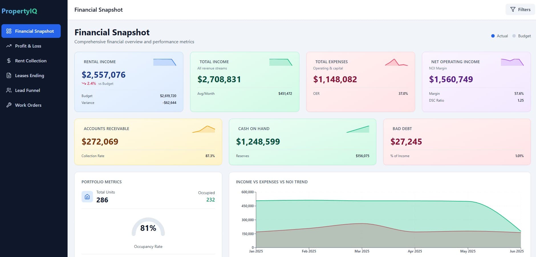
Most headline numbers carry their context with them. Net operating income sits next to its margin and DSC ratio, accounts receivable sits next to the collection rate, and occupancy is drawn as a gauge against the unit count rather than printed as a bare percentage — the card shows the number and what it is relative to.
Forward-looking, not just historical
Revenue-at-risk is charted by month using upcoming lease-expiration dates, and the leasing funnel is shown as a stage-by-stage bar chart so a drop-off between touring and applying is visible at a glance rather than buried in a table.
Operational data alongside the financial data
Work order volume, aging analysis on unpaid rent by day bucket, and a lead-source breakdown sit in the same platform as the P&L — built to show that operational and financial reporting can be modelled from the same underlying data rather than reconciled after the fact.
What each view argues
Every dashboard is making a specific case about what a property manager should be able to see without opening a spreadsheet.
Financial performance, at a glance
The financial snapshot opens on rental income, total income, total expenses, and net operating income as paired cards, each with its own trend indicator, alongside an income-vs-expenses-vs-NOI area chart spanning the portfolio.
Collections, broken down by age
The rent collection view sets total charged against total collected and outstanding balance, then breaks the outstanding balance into a 0-30/31-60/61-90/90+ day aging chart so a manager can see not just how much is unpaid, but how overdue it is.
Lease risk, plotted before it happens
A revenue-at-risk bar chart projects potential annual revenue loss by month from unrenewed leases, paired with a table of upcoming expirations tagged by urgency — the argument is that lease risk should be visible months ahead, not discovered at renewal time.
The leasing funnel as a chart, not a spreadsheet
Total leads, contacted, toured, applied, and signed are rendered as a stepped bar chart with the conversion rate at each stage, next to a lead-source donut breaking down where those leads originated.
Built with
One data model, six views
Financial, collections, leasing, and maintenance reporting are usually built and maintained as separate tools that get reconciled after the fact. PropertyIQ models them as views over one shared dataset instead, so a lease expiration shows up consistently in the revenue-at-risk chart, the leasing funnel, and the portfolio metrics without a separate sync step.
Want something built to this standard?
This is the level of design and engineering we bring to client work — whether that is a marketing site, a BI platform, or the application behind it.